 |
| via |
I'm especially excited to talk about choosing wall color today,
 |
| via |
Meet Revere Pewter by Benjamin Moore.
 |
| via |
It is their most requested color.
It is considered one of their most beautiful
and certainly the most beautiful gray of all
 |
| via |
It is soothing gray with a warm undertone.
That makes is extremely agreeable
playing well with other colors
 |
| via |
Equally happy on cabinets
 |
| via |
or walls...
It goes through subtle transformations throughout the day
 |
| via |
as the light changes in your home
all of them beautiful
 |
| via |
looks equally elegant with dark woods
 |
| via |
or lighter woods
 |
| via |
remains quietly neutral when more vibrant colors are present
(it has excellent manners)
 |
| via |
and is not opposed to beige or tan as companions
 |
| via |
in fact it embraces all colors
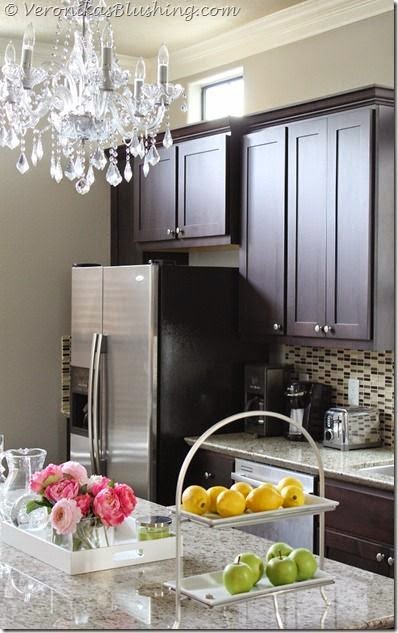 |
| via |
in the kitchen it allows steel to shine and crystal to sparkle
 |
| via |
stone loves it
 |
| via Pinterest |
creamy white charms it
 |
| via |
dark woods make it dramatic
 |
| via |
It has the ability to lighten and lift a space
 |
| via |
it can appear warm and cool in the same day
 |
| via Pinterest |
it goes with other grays
 |
| via Pinterest |
and cream or beige equally well
 |
| via Pinterest |
On its own it is elegant and calm
 |
| via |
with other colors, it is inviting and warm,
 |
| via |
soothing
 |
| via |
friendly,
beautiful
So, by way of explanation - I've been under wraps - literally - as everything has been covered in plastic while painting.
I will use that as my excuse for not posting diligently last week.... "my computer was saran wrapped" - not exactly 'the dog ate my homework' but close enough. It has been chaotic... and unsettling...but I'm looking forward to talking to you about color today...

I went about choosing this wall color a little differently. I wanted a new look. I was tired of the beige/tan with the gold undertone - although it served me well for over 10 years - I needed a fresh new look.

I decided to choose a grayed down neutral, and really didn't worry about whether it would go with my furniture or drapes - at least not in a 'color matching' sense - I knew a nice neutral would go with just about anything. Instead, I looked for a color that would provide a good backdrop to my room, and wouldn't clash with fabric choices I wasn't necessarily ready to change.

I also looked at the wood tones against this color and how the trim would look, as I wasn't changing that anytime soon. Currently, my trim is Dunn Edwards Swiss Coffee and I have an assortment of antique furniture in woods ranging from furniture in light pine to rich walnut. I will also be adding a hardwood floor to this mix, so the color really had to be friendly to all of these wood tones...

And then, I also wanted a color I really really liked. I wanted to love it when I walked into the room while it was devoid of furnishings, and love it when it became more of a background as the furniture was put back in place and took center stage.

I chose Revere Pewter by Benjamin Moore. I LOVE it. I can't wait to put the furniture back in place and see how it all looks together - but I already know it will be amazing. The room feels lighter, fresher, calmer. PERFECT.

So, how to pick the perfect wall color? First, it needs to be a color you can live with for a long, long time. Beware of layering too many same-style colors - for example if you have warm colored fabrics, warm wood tones, warm accent pieces - don't also choose a warm toned paint for your walls. All that warmth adds up and you may end up with space that is way over heated. Better to play opposites a little - The same is true of too many cool tones. It can get a little cool, or frosty, without a little warmth thrown in.

On the color wheel in any art or design class you will learn that the complementary color - the colors directly across the color wheel from each others - are colors that make each other look their best. For example the complementary color to orange is blue; also red/green and yellow/purple. Each warm color is complemented by a cool color. And vice versa. If you choose a cool neutral as background to your warm decor, it will feel better and the colors will look better.

I also believe that a wall color needs to be more neutral. A grayed down version. It is more livable in the long run. It won't vie for attention and will sit nicely in the background making everything in the foreground look better. That isn't to say you can't choose a 'color'. Navy is a neutral. Blues, greens and purples with a gray undertone are neutral. Beige, tan, brown, taupe - all neutrals. If you love color - go wild with the fabrics and accessories!

**********************************************************************************
QUESTION FROM A READERHello Ms. Barnett,
My husband and I live in North Carolina and we need your help! Three years ago we bought our house
out of foreclosure and we have been working ever since to make it into our home. We recently
installed flooring in our main floor.

We are struggling to find the appropriate wall color! The main floor is basically an open floor plan, when you walk through the front door you have the dinning room to the left and stairs to the right, the living room is behind the dining room and the kitchen is down a short hallway. The kitchen is separated by archways. The majority of our furniture is brown and our accessories are brown/black. As I said we are trying to find the right color to paint our main floor, we want something neutral and have been back and forth between beige and gray. Every time we think we have a color we bring it home and paint the walls and it looks terrible. Do you have any suggestions on paint colors? Specially, names of paint colors. We are reaching frustration and need some help.
Thank you! Cassie
 |
| Behr Paint WHEAT BREAD |
Hi Cassie!
If you are bouncing back and forth from beige to gray - try a greige. Greige is a grayed down beige, or a gray with a beige undertone. Much like the Revere Pewter I talked about in this post.
Here are a few other Greige choices to try - all should look wonderful with your wood flooring, the furniture and the brown/black accessories.
 |
| Benjamin Moore COPLEY GRAY |
Should you decide to add a pop of color in accessories or fabrics,
 |
| Houzz |
you will find most colors will look good with this neutral.
 |
| via Sherwin Williams AGREEABLE GRAY |
 |
| Sherwin Williams PERFECT GREIGE |
 |
| Sherwin Williams PAVILION GRAY |
 |
| Sherwin Williams AGREEABLE GRAY |
 |
| Sherwin Williams MINDFUL GRAY |
 |
| Sherwin Williams MEGA GREIGE |
 |
| Sherwin Williams AMAZING GRAY |
Good Luck!!

No comments:
Post a Comment
Highly intelligent comments from amazing readers...